Make Your Resources Visually Appealing!
Get ready to create attractive, eye-catching, visually appealing resources for your classroom in three easy steps!
*Note: This post was written before I discovered the magic that is Canva. If you don’t have a Canva account, please go get yourself a free educator account right this second. I promise it will change your life in extraordinary ways.
If you still want to use PowerPoint or Publisher or have existing documents to pretty-up, then by all means read the post—it’s an oldie but a goody!
Here’s what you’ll need to make visually appealing resources:
- Microsoft Publisher or PowerPoint
- A Teachers Pay Teachers account
- A folder on your Desktop labeled “Darling Docs” or “Things I Made Pretty” or something along those lines.
- A resource or document that you’ve created (start with something easy)
- Patience and time to experiment
- A margarita or another beverage of choice
Here’s what you don’t need:
- A background in web design
- An in-depth knowledge of Publisher or PowerPoint
- A fixed mindset
Are you ready??
Open up your laptop and let’s get ready to create somethin’ real pretty!
Step 1: Frames
Think of the frame as the Spanx of your document. It holds everything in place and makes it look streamlined and put-together.
We’ll start by downloading cute frames from TPT.
Go to the search bar. Type in “digital frames” and then refine your search by clicking on “free”. Scroll through and download whichever ones catch your fancy.
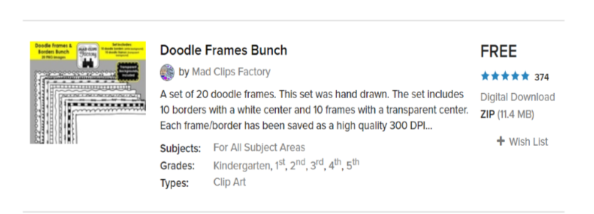
I’m going to use these fun doodle frames from Mad Clips Factory.
Save them to the folder on your desktop so they’re readily available.
If they come in a zip file make sure you click on “Extract All” before saving.
Open up a new file in either PowerPoint or Publisher.
In your new document, click on the “Insert” tab and then click on “Pictures”. Locate your new frames from the file on your desktop. Once it inserts, you’ll have to resize it to fit your page.
Click on your newly inserted frame to select it.
Click on the “Home” tab again.
Click on the little arrow next to “Send Backward” and select “Send to Back”. This will send the frame all the way to the back of your document so you can layer text and images on top of it without the frame interfering.

Become familiar with the Bring Forward and Send Backward tools as you’ll use them often!
Click on the “Insert” tab again. Click on the little arrow under “Page” and select Insert Duplicate Page. (If your document is more than one page then this little hack will save you from inserting a frame all over again.)
You can also play around with inserting blank pages with different frames to see what you like best.
That’s it! Step one done!

Step 2: Images
Images are like the first impression you make on a blind date; they either attract or repel so choose wisely!
Let’s say I want to create a welcome sign to hang on my classroom door. I’ve already added my frame, but now I need one really great stand-out image to draw visitors’ attention.
Once again, I’m going to check Teachers Pay Teachers. I put in a search for “student clip art” then filter to “free”. I also searched “watercolor bunting” and “chalkboard” because those are the essence of my classroom decor.
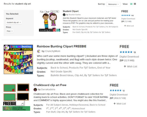
Ooh, these clip-art students look adorable!
I also love this free rainbow bunting!
Or what about a clean-looking chalkboard to catch the eye?
I’m going to download them all, just for kicks. I also won’t forget to Extract All, and save to the folder on my desktop. Now, just to see what else is out there, I’m going to deselect the “free” filter and look at some other graphics that (gasp) cost money.
But gah, there are so many cute ones!
If you’re able to spend a little bit of change, I highly recommend supporting one of these incredibly talented teacher-artists:
Melonheadz graphics Bricks and Border
Write Lovely Paula Kim Studio Teaching in the Tongass
Their clipart is downright precious and will really add that first impression pizzazz that we’re looking for.
Aside from TPT, there are plenty of other places to download quality image files.
If you’re looking for stock photos instead of clipart then I highly suggest Unsplash for gorgeous, high-quality, free images.
I’m also a huge fan of Etsy for clipart. For the price of a vanilla latte you can purchase a beautiful file of high resolution images to use again and again in your documents.
So what are you waiting for?? Open up that file on your desktop and start downloading your very own library of images, stock photos, and clipart!
Once you’ve saved your images, choose which one(s) will look best in your document.
Styling Tip: Less is more! Keeping your documents uncluttered is much more pleasing to the eye than a page jammed full of stuff. Choose one or two really great images and then hit the brakes!
To insert an image you can do one of two things:
-Copy and paste it directly into your document
-Click on the “Insert” tab then click on “Pictures”. Locate your saved file then click the “Insert” button.
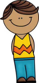
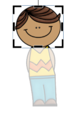
Once you’ve inserted your image you’ll probably need to resize it to fit your space.
This dude was way too big so I clicked on him and used the dots and lines to adjust his size accordingly.
Let’s say I want to crop the image to just show his face. Select the image once again by clicking on it. Once you click on the image a new tab will pop up on your tool bar called “Picture Tools”. Click on the tab, then click on “Crop”.
Adjust the bold black lines and corners until you’ve reached your desired image dimensions and then click away. You’ll be left with a perfectly cropped image, or in my case, a beheaded little smiley face.


Step 3: Text
The words on your page must be typed with an attractive and updated font. Lucky for you, font downloading is my very favorite mindless pastime (aside from online shopping and HGTV), and with a little coaching and sweet talk I think it could be yours too.
Come to think of it, I can download fonts while I shop online and watch HGTV.
Your life can be this full too.
Start by going on Pinterest. Yes, I know it’s a black hole of content that stirs up deep feelings of inadequacy but for the sake of fonts take a big gulp, put your blinders on, and proceed to the search bar.
Type in “free handwriting fonts” or “fonts for teachers” or “font pairings for the classroom” and see what comes up.
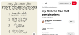
Ooh. This one looks promising. Let’s check it out!
I went ahead and followed the link to Font Squirrel where I downloaded Learning Curve and Latin Modern Roman (#3). Remember to extract all files before doing anything else. Click “install” and then you’re all set!
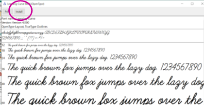
Behold, the Magic Font Installation Button.
It will completely change your life for the better.
Spend some time exploring Pinterest and all it has to offer by way of free fonts.
Once you come up for breath—approximately five hours later—you can check out these other fantastic free font hideouts:
You can absolutely troll TPT for free fonts, HOWEVER, unless you want the same fonts as everyone else you’re better off spending a few dollars for something super sassy, fun, and unique.
Here are few TPT font artists worth checking out and spending money on:
-A Primary Kind of Life: APL Fonts
-Kinder Pals: KP Fonts
-Miss 5th: BB Fonts
-Amy Groesbeck: AG Fonts
-Kaitlynn Albani: KA Fonts
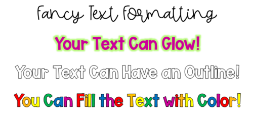
You can find these formatting options and many more by selecting your text and then clicking on the “Text Box Tools” tab.
Play around with the Text Fill, Text Outline, and Text Effects options.
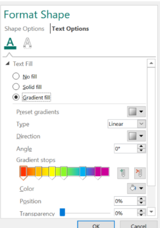
*A super cool text effect is creating an ombré fill.
What?!
To do this, go to Text Fill then Fill Effects. Select the circle button next to Gradient Fill. Find the Gradient Stops feature. You can add or take away gradient stops in any color you wish.
I chose to go with the rainbow theme of the bunting clipart but you can go wild creating any ombré color palette your little heart desires.
Almost there!
Just one more text tip and then I promise I’ll leave you alone!
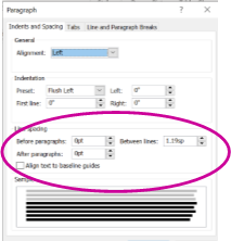
You’ll want to adjust the line spacing to allow your text to fit the page just so. Too much spacing between lines is a waste of valuable page real estate and it also detracts from that professional-looking aesthetic that we’ve been aiming for.
To adjust the line spacing, select your text then click on the Line Spacing tab.

Click on Line Spacing Options.
Ensure that the spacing before and after paragraphs is 0pt. You can also adjust the spacing between lines.
You may have to play around with the between-line spacing until you find the sweet spot.

Well done!!
Do you feel as if you’ve ran a marathon??
I’ve never ran a marathon but I imagine I’d be just as wiped. Well, not in the physical sense but you know what I mean.
Learning a new skill (especially one that involves technology) is definitely not for the faint of heart.
But you can do it. You can make your resources beautiful and visually appealing and you can do it without banging your head against the wall and yelling at your kids!
Just like anything else, the more you play around with it and the more you practice the easier it becomes. You’ll figure out what works, what doesn’t, and your own personal style will begin to emerge from the rubble.
Listen: It’s definitely not easy, but it most definitely can be done!
Now go forth and make those resources visually appealing!

